Prototyping, User Testing, App · Boots · 2024
Role: Lead Product Designer
Team: Researcher, Illustrator, Project Manager, Solution Architect, Development team
Platform: Native App (later adapted to Web)
A significant share of seasonal sales are gift purchases, yet the app lacked a dedicated experience to support users through the gift-buying journey.
Design a guided, gift-buying experience that integrates with existing product taxonomies and scales for seasonal campaigns.
The concept was validated through testing and later adopted by the web team, launching as a live Christmas gift finder on the website.
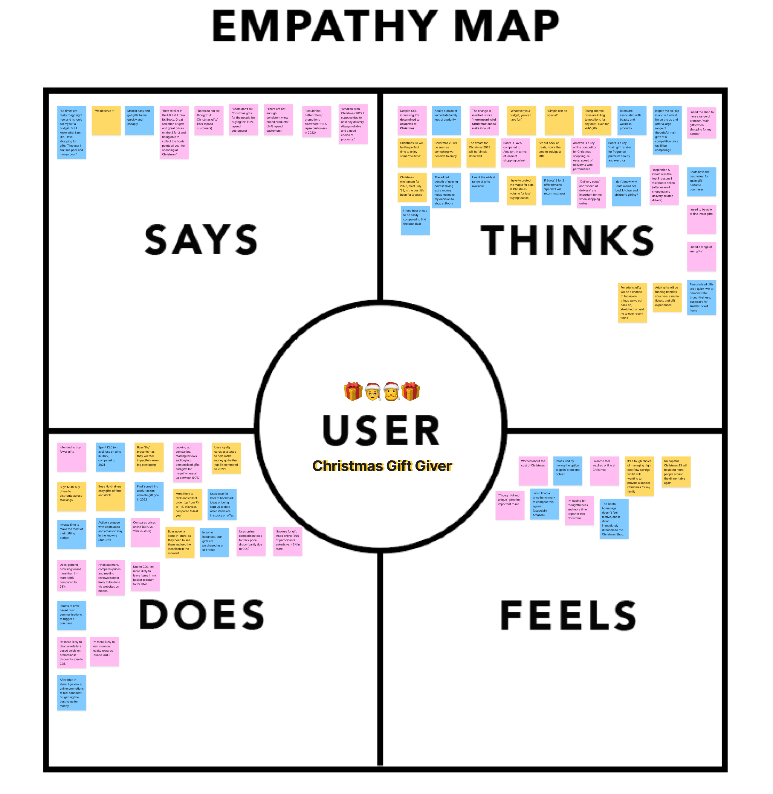
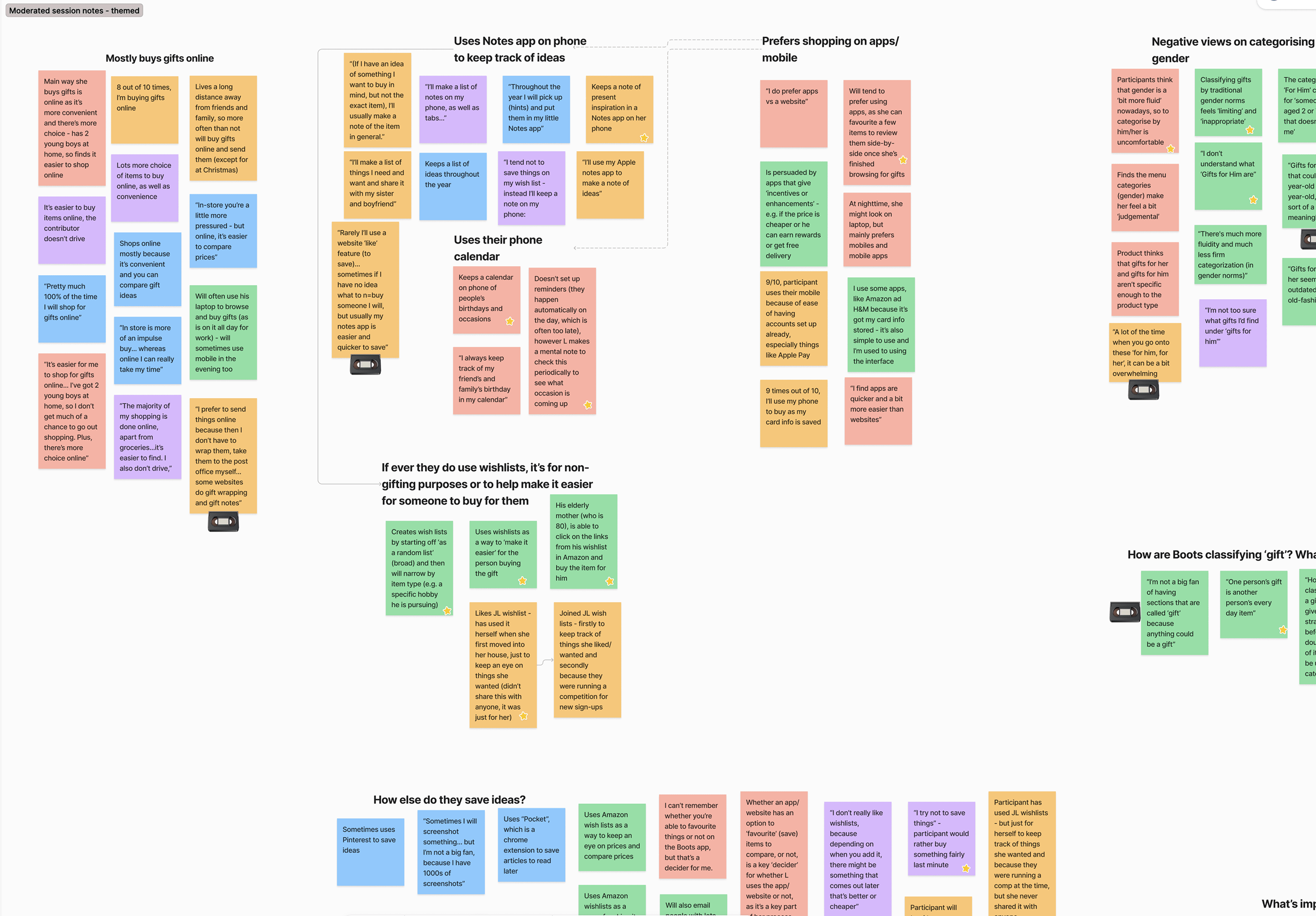
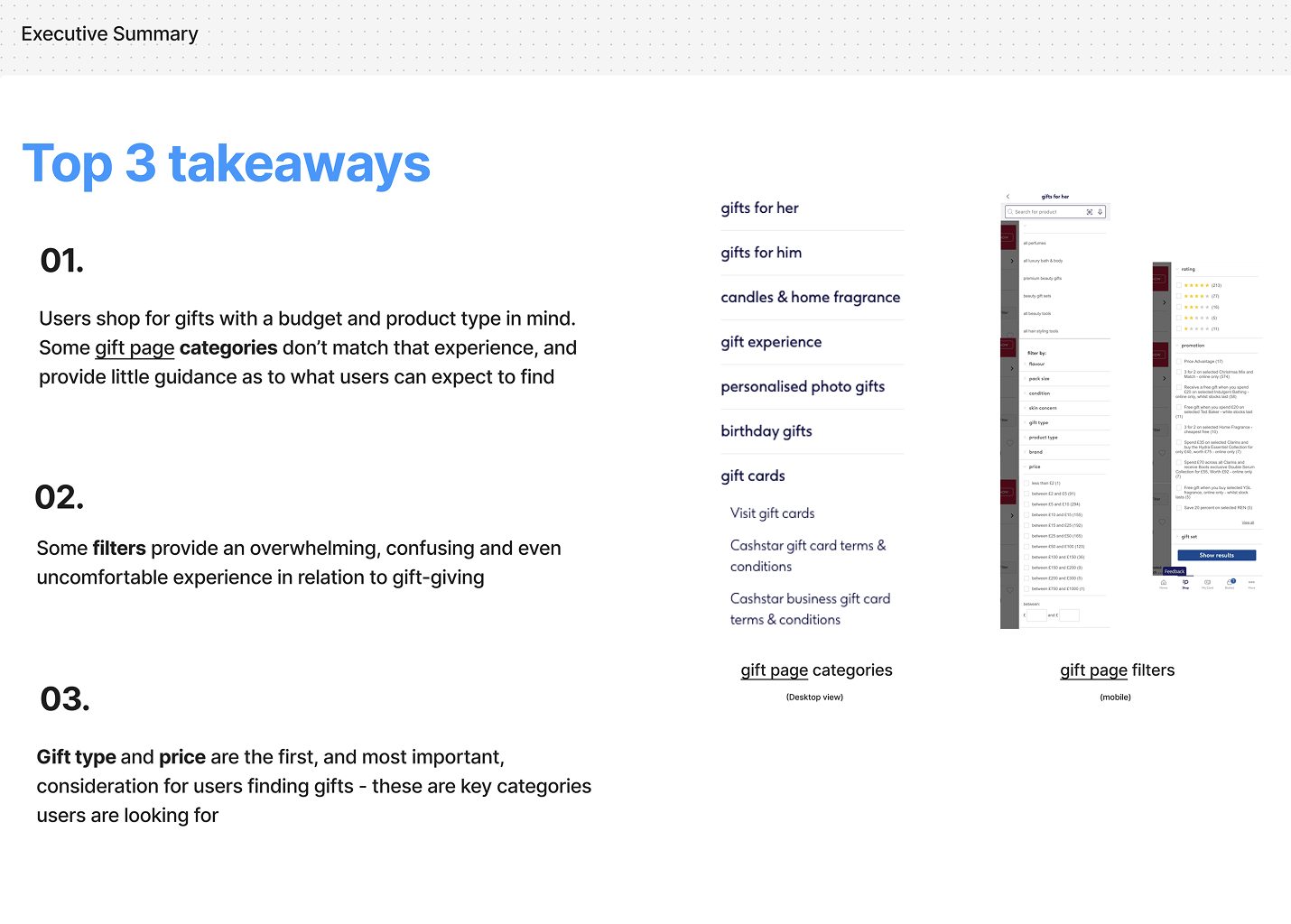
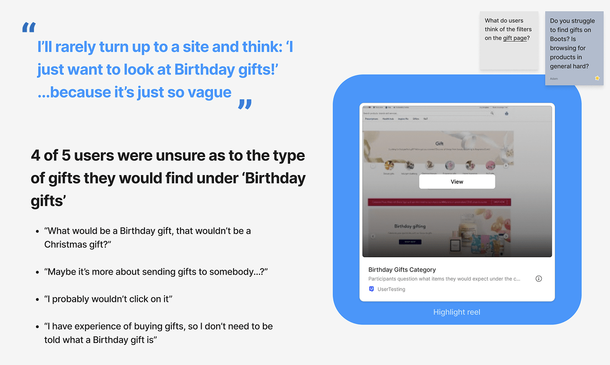
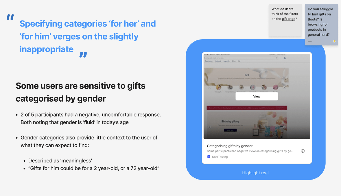
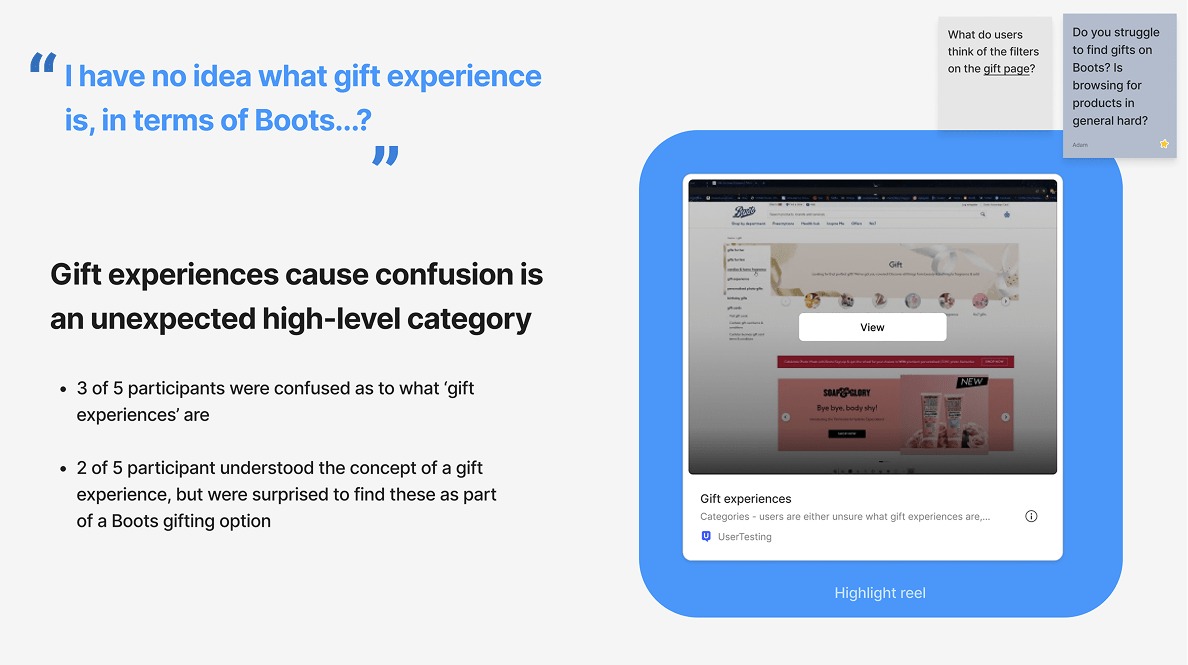
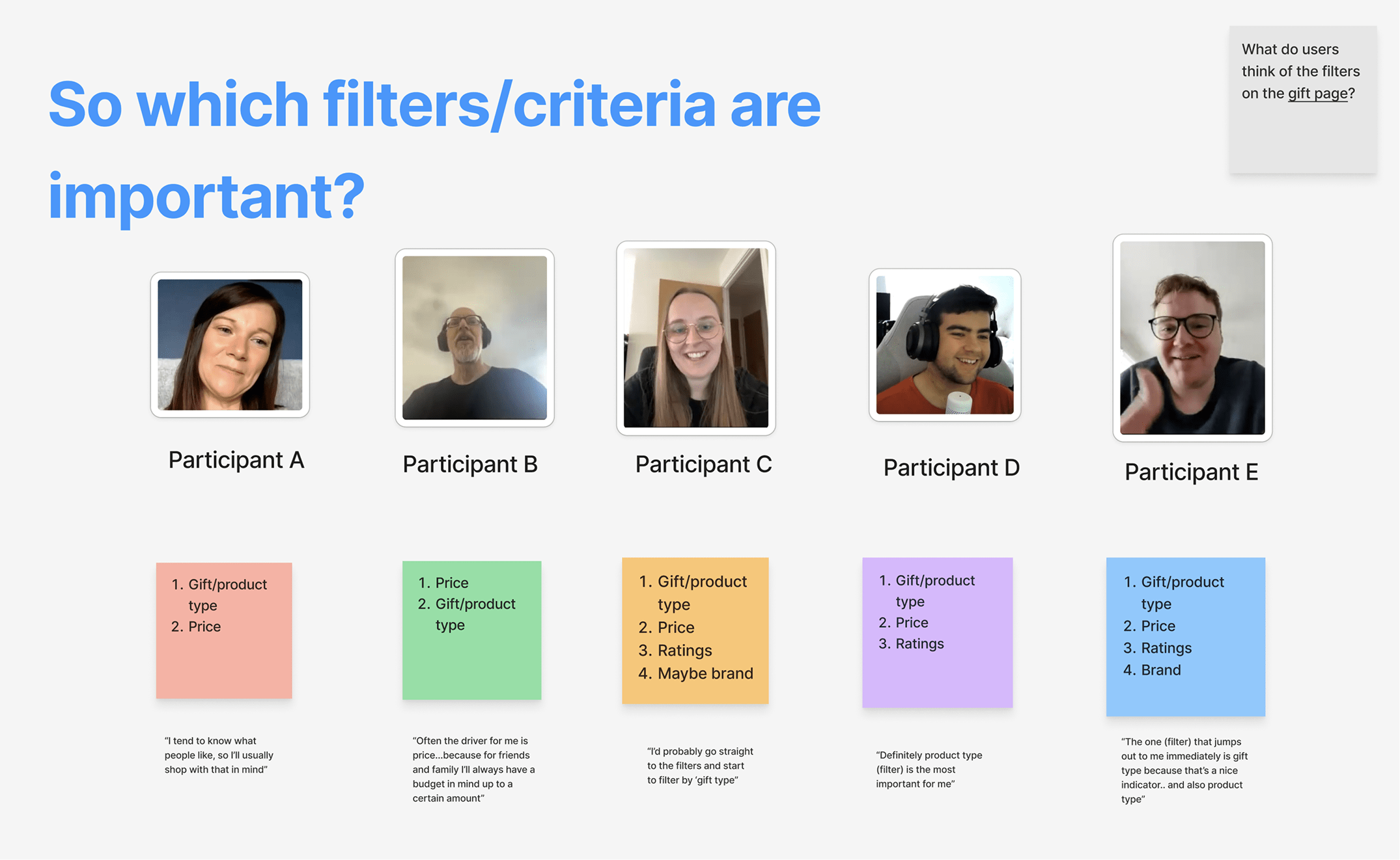
Key insights surfaced through collaboration with the research team, shaping both the structure and language of the experience.
I defined the initial flow and early visuals, then facilitated a stakeholder walkthrough to align on direction and feasibility. This surfaced key technical constraints and opportunities to simplify the journey, informing the next iteration and ensuring alignment with existing backend capabilities.
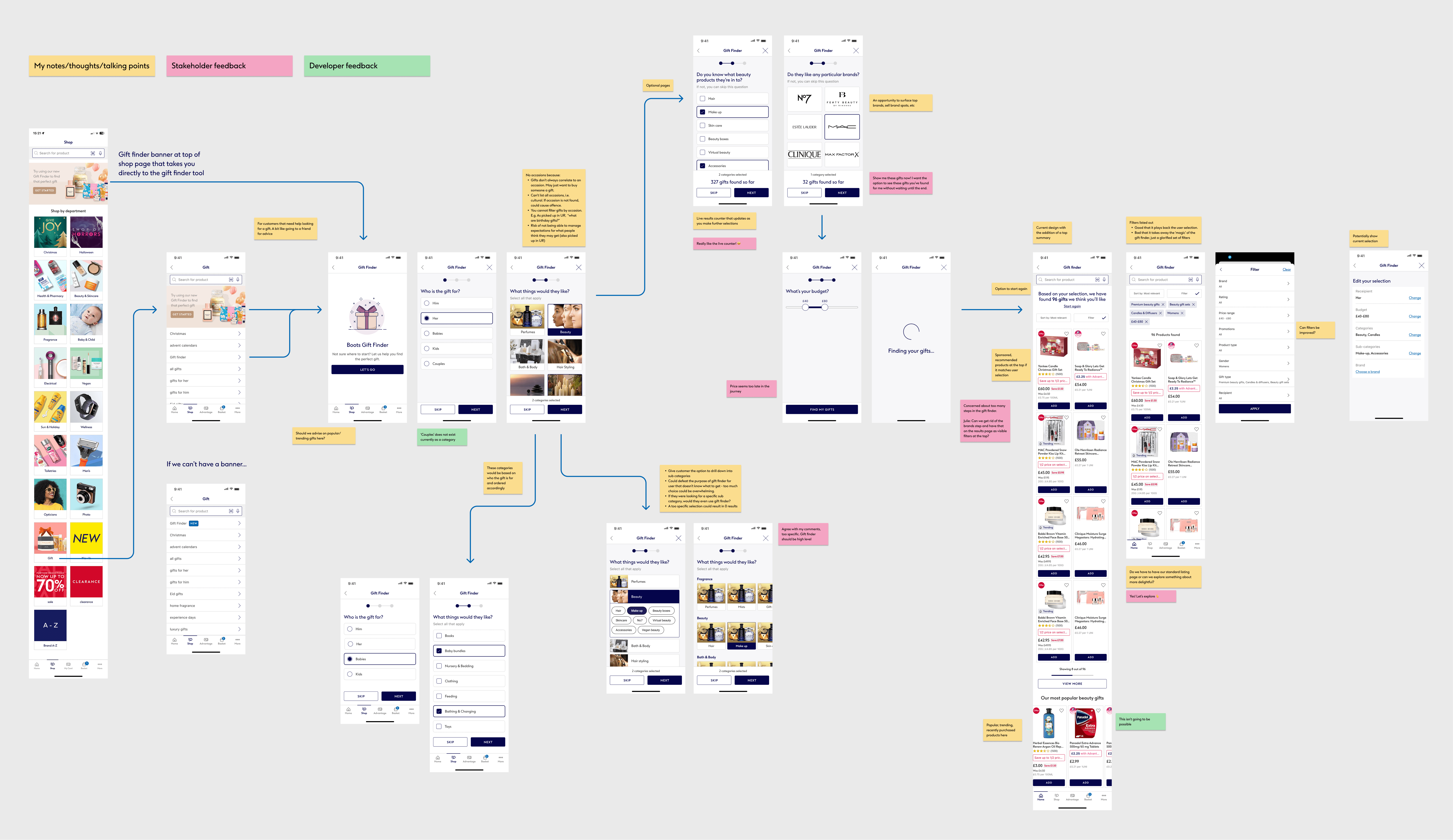
We ran two rounds of usability testing (unmoderated, then moderated) to validate whether a guided flow could help users make confident gift choices without increasing friction.
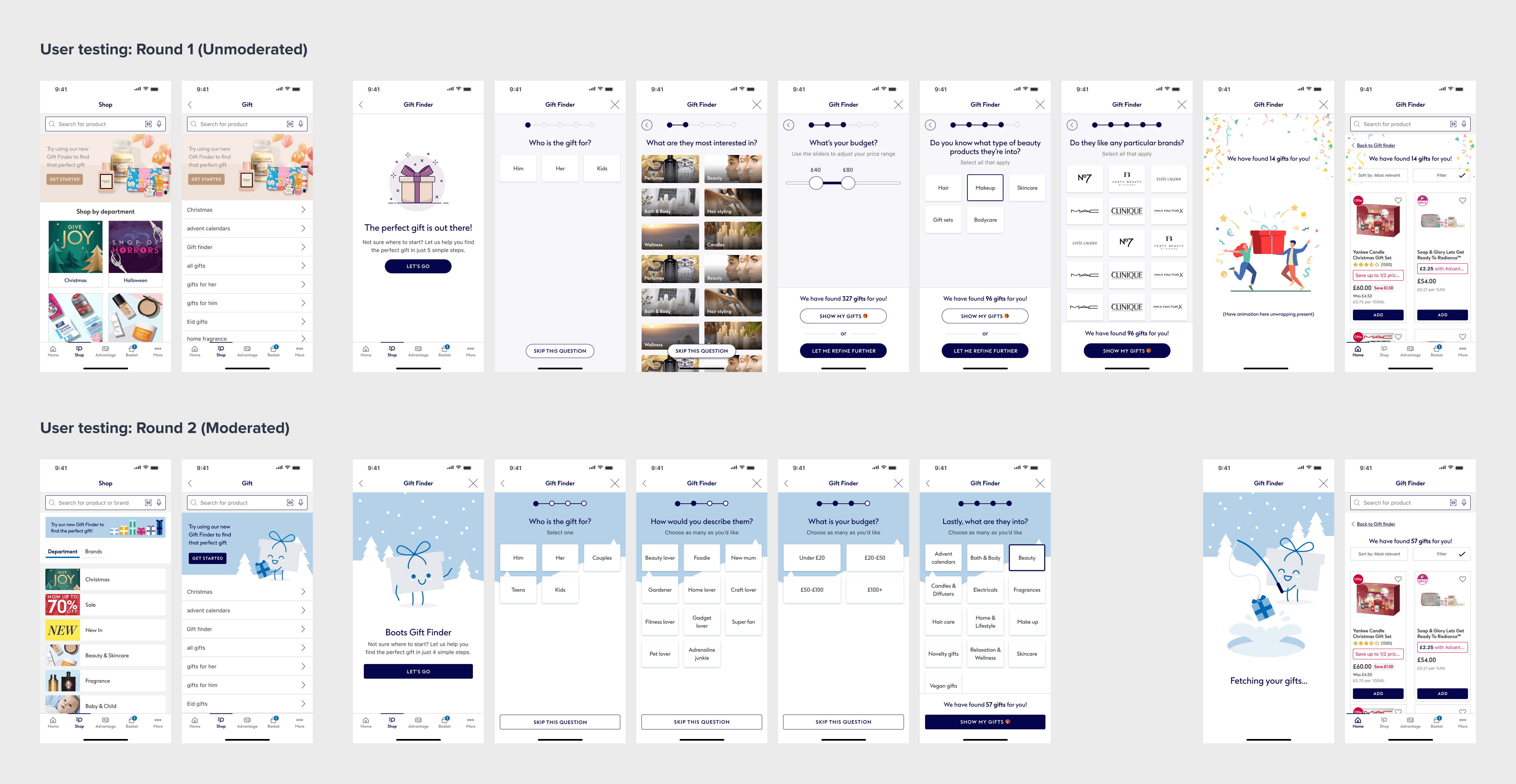
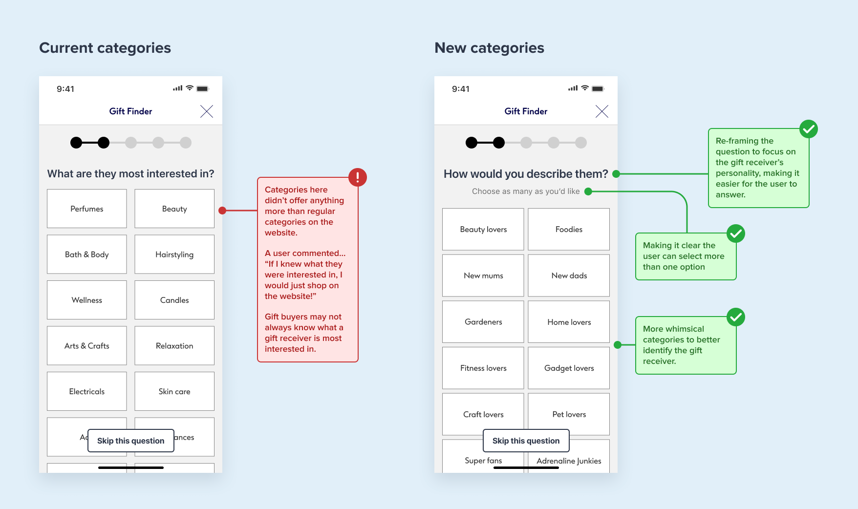
User feedback revealed that asking about the recipient’s interests assumed prior knowledge, which conflicted with the goal of helping indecisive shoppers. I reframed the flow around the recipient’s personality instead, creating categories that better guided users through the gift-finding process.
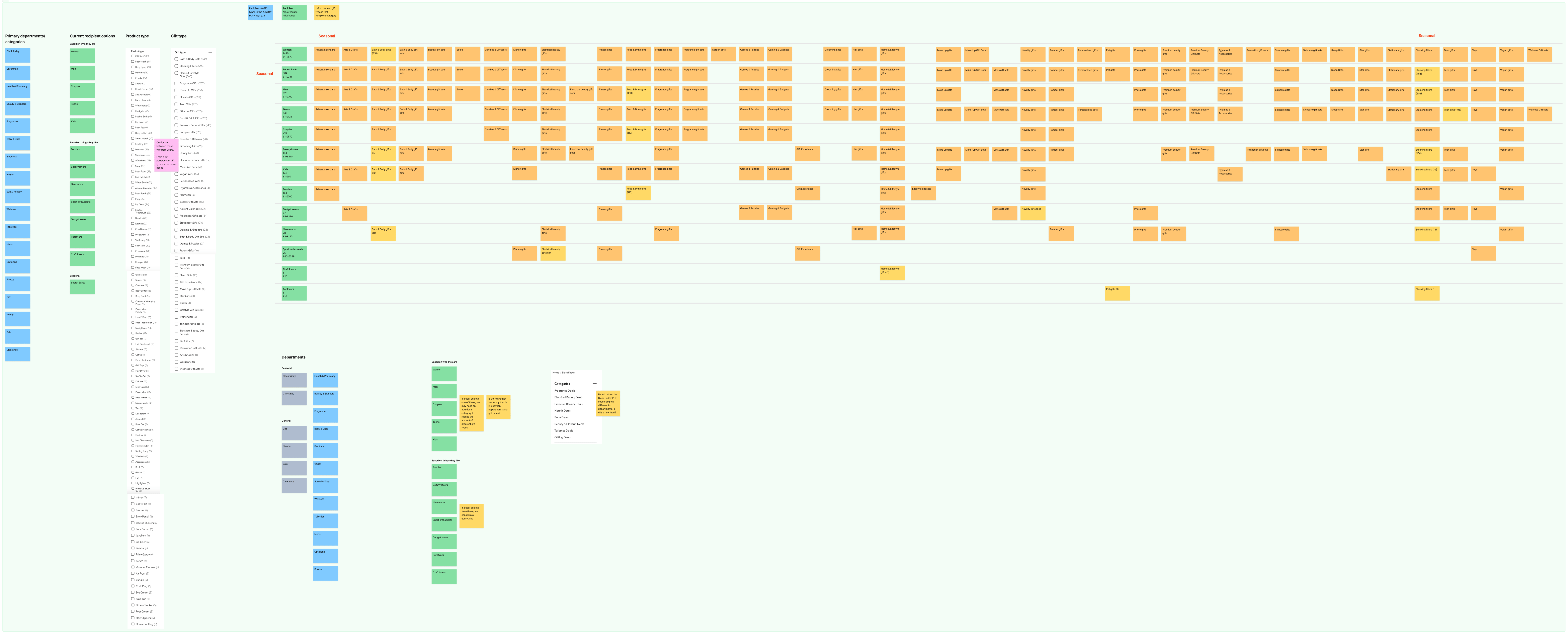
With existing backend categories fixed, I collaborated with the technical team to map the new personality-based categories to the current taxonomy, ensuring the redesigned experience aligned with existing system constraints.
The native app implementation was paused due to reprioritisation; however, the concept was adopted by the web team and launched for the Christmas period. I supported the adaptation and handover to ensure the design intent was preserved across platforms.