Click & Collect Variations
UX, UI Design · John Lewis · 2019
A look at the experimentation around John Lewis’ Click & Collect proposition.
This is more of a high-level look at the different explorations of the design I went through, with feedback from real customers, testing sessions and stakeholders.
Since I designed the original layout, there has been a need to address ongoing design concerns from customer feedback and seeing if we could better surface our Collect+ proposition.
I've left out previous iterations and my process on getting to the current layout, just to avoid this turning into an even longer case study!
A horizontal scrolling pattern for one of the variants.
Background
When ordering online, John Lewis offers the option of getting your order delivered or allowing you to collect from a shop. At the time of writing, there are two collection methods: 'Click & Collect' and 'Collect+'.
-
Click & Collect
This option allows a customer to collect from any John Lewis or Waitrose shop. The order is usually ready to collect the following day. The order is free for orders £30 and over, otherwise, there is a £2 charge for orders below £30.
-
Collect+
This option allows the customer to collect from any local shop offering Collect+ services. This may be more convenient for customers who do not live close to a John Lewis or Waitrose shop, however, there is a £3.50 charge, regardless of order value.
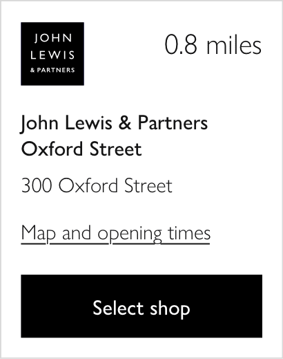
Current / Live version

Features
-
Search results are ordered by distance
-
Nearest John Lewis shop is top of the results
This was a business-led decision and will show within a 30-mile radius of the customer's search. If no John Lewis store within 30 miles, this will not show.
-
Collect+ is hidden by default
The reason for this decision was two-fold.
- Firstly, the business case. Collecting from John Lewis or Waitrose is cheaper for the business as it encourages more spend in stores plus warehouse vans would already be delivering to those stores. If the Collect+ shops were visible by default, they would have overshadowed the John Lewis and Waitrose shops due to the number of Collect shops in the area. E.g. a customer maybe only 0.3 miles away from a Waitrose shop however the first 1-2 pages would be Collect+ shops.
- Secondly, the customer case. We had plenty of prior research and feedback indicating the majority of John Lewis customers would not want to pay for collection, especially not £3.50 and would likely opt to have their order delivered instead for free. So if a customer saw 1-2 pages of Collect+ shops, they may not see a free John Lewis or Waitrose shop.
Feedback
This is a summary of the feedback we got via testing in the lab, real customers, complaints and stakeholders within the business.
- Some customers were confused about why John Lewis shop was at the top, even though it wasn't the closest. However, some understood it was a business decision.
- When testing in the lab, most participants noticed the Collect+ tab but didn’t click it due to the high cost. However, some missed it completely.
- Hiding the Collect+ option by default resulted in a 50% decrease of orders going through Collect+. The Collect+ team wasn’t happy :( (There was a hypothesis that those customers may have opted for delivery instead but unfortunately we were unable to get that data).
Iteration 1
Features
-
Highlighted two nearest 'partner shops' within a 10-mile radius.
Partner shops referring to John Lewis or Waitrose. If only one of these shops is available, then only one will be highlighted. If none within 10 miles, then nothing is highlighted.
-
Show the full list of results in order of distance including the highlighted shops above and Collect+.
By highlighting the shops above, we are satisfying the business by ensuring those shops are surfaced, yet also giving customers the full offering.
Feedback
- Mixed reactions from the first two boxes. Some understood why they were highlighted, some didn’t, despite the heading. Again customers thought this was a business decision. All of this ambiguity increased cognitive load.
- Based on the heading users expected to see all free shops, not just two.
- Due to the high volume of Collect+ shops, some felt the ‘full results’ list were for Collect+ only, so were confused why a Waitrose store was repeated in the list.
- Some users missed the price, felt there wasn’t as much prominence.
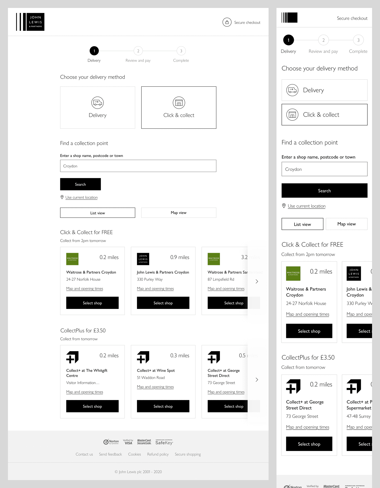
Iteration 2
Features
-
No highlighted shops
-
Two lists: Partner shops with free collection and Collect+ shops for £3.50
Three shops are shown by default in each list with the option to show more if required. If less than three shops within a 10-mile radius, then will only show those.
Feedback
- All users understood this layout and how to reveal more shops.
- They all thought the order was logical (free ones first, then distance).
- All users felt the information displayed was just right.
- The only problem with this layout was not all users saw the Collect+ shops on mobile.
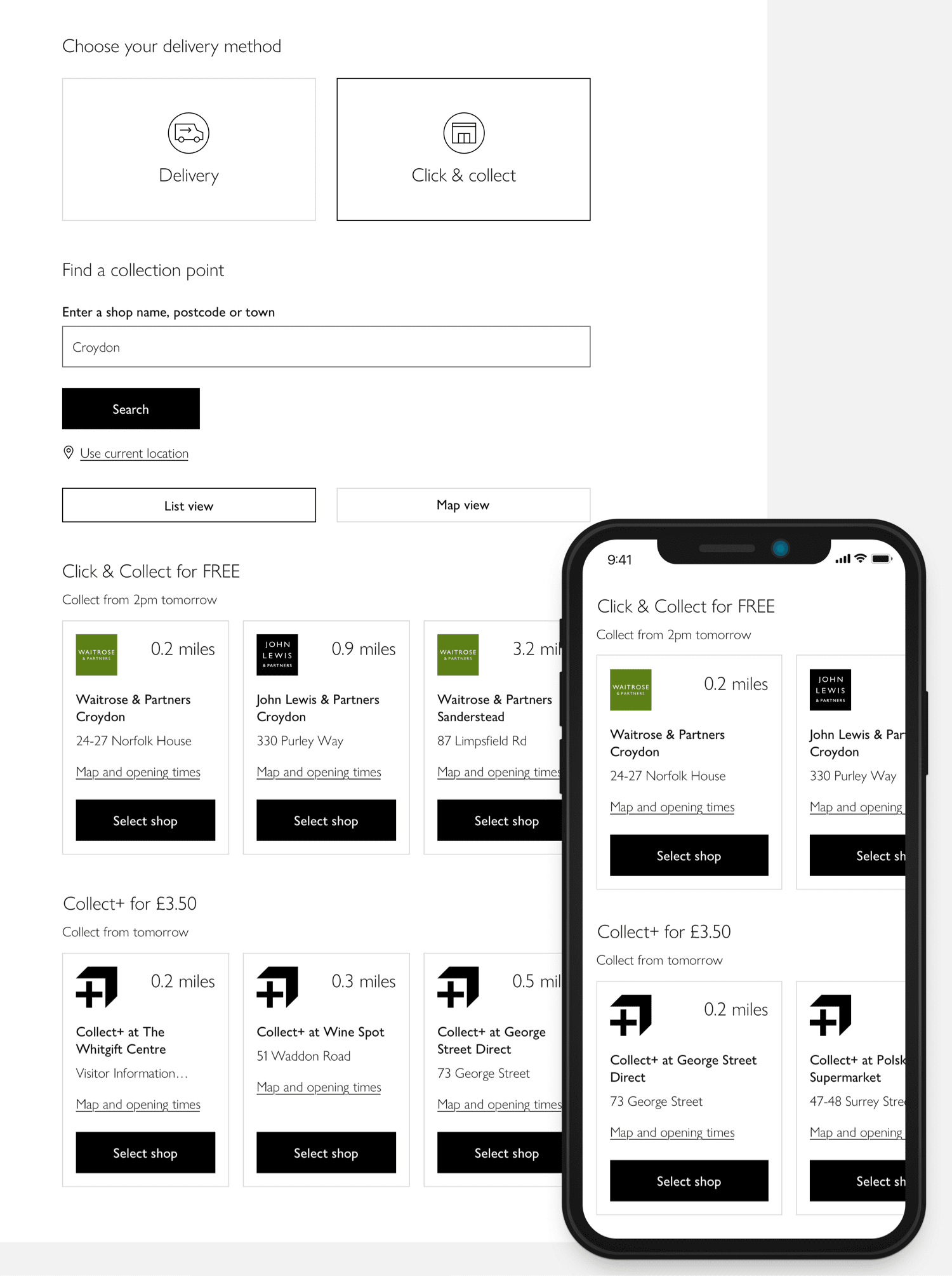
Iteration 3 (Final)
Features
-
Similar to the previous iteration with no highlighted shops and two separate lists
This was purely a visual change compared to the previous iteration.
-
Lists are presented horizontally instead of vertically
The horizontal layout allows more shops to be presented without pushing down the Collect+ list.
-
Using the 'off-canvas' pattern
Having part of the right image obscured encourages users to swipe across to reveal more. This is great for smaller devices however for desktop browsers where horizontal swiping isn't as natural, I added buttons to mimic a standard carousel.
Feedback
- All users understood the horizontal swiping pattern instantly.
- Participants liked having more shops visible at once as it was easier to compare the two lists and their prices on a small screen.
- Even though shops were originally hidden, it was perceived as having “more options available” due to no ‘show more’ button. “More info, fewer clicks”.
- This design encourages Collect+ more than the previous version, making a few users consider Collect+ who were initially adamant they would never pay for collection. This was because they saw how close their Collect+ shop was compared to a Waitrose shop.
- Majority of users found this layout more intuitive and clearer than the previous version. Less cognitive load. Two users commented on how they liked that the shops were contained within a border.
Final layout
How the layout is displayed across all popular screen sizes. Chevrons adjusted on big screens to fit in with the UI kit shared across other teams.
Dealing with edge cases.
Ready for AB testing
Although this design has been validated with several user testing sessions, a big change like this will need an AB test to ensure we are not harming conversion. Unfortunately, I left John Lewis before this could take place so the project has now been passed on to my successor. I wait anxiously for the day this project is AB tested and hopefully made live!