UX, UI, Design Systems · John Lewis · 2016-2020

Redesigned the end-to-end checkout experience, used by millions of customers
Helped deliver a “state of the art” checkout experience benchmarked by the Baymard Institute

Co-created a design system adopted by 20+ designers across multiple teams
John Lewis’ checkout UX performance surpasses many top-grossing e-commerce stores benchmarked by Baymard. With state-of-the-art performance in Form and Page Design, and consistently strong results across other areas, the overall checkout experience ranks among the best evaluated.
Baymard Institute. View full summary
During my time at John Lewis, I led the design and evolution of the end-to-end checkout experience across multiple features and journeys. The work focused on improving usability, accessibility, and conversion while supporting a large-scale rebrand and an evolving design system.
I worked closely with research, product, engineering, optimisation, and analytics to balance customer needs, commercial goals, and brand standards.
Design decisions were grounded in a combination of qualitative and quantitative insights including:
Below are examples of how research, prototyping, testing, and collaboration informed key checkout decisions.

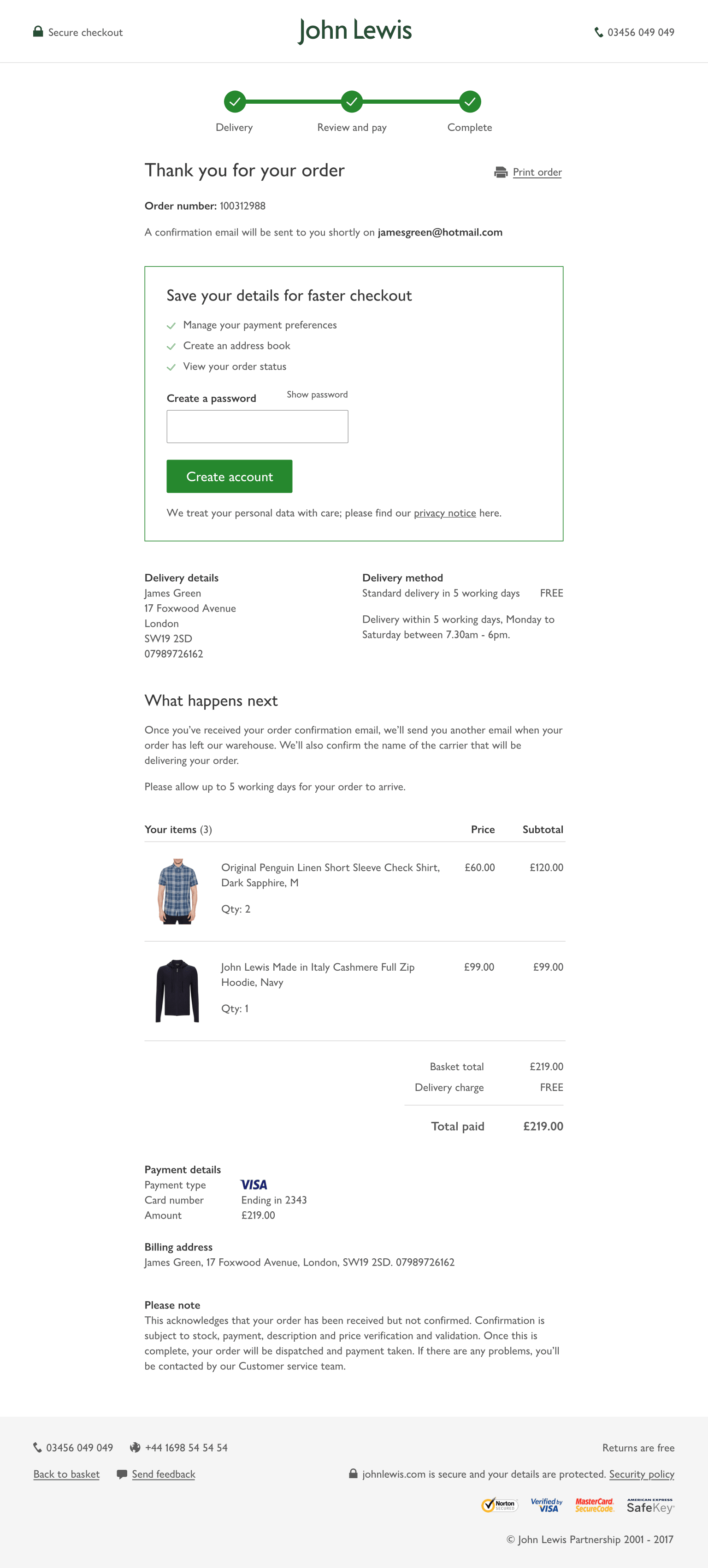
Using card sorting to understand user expectations for the order confirmation experience.


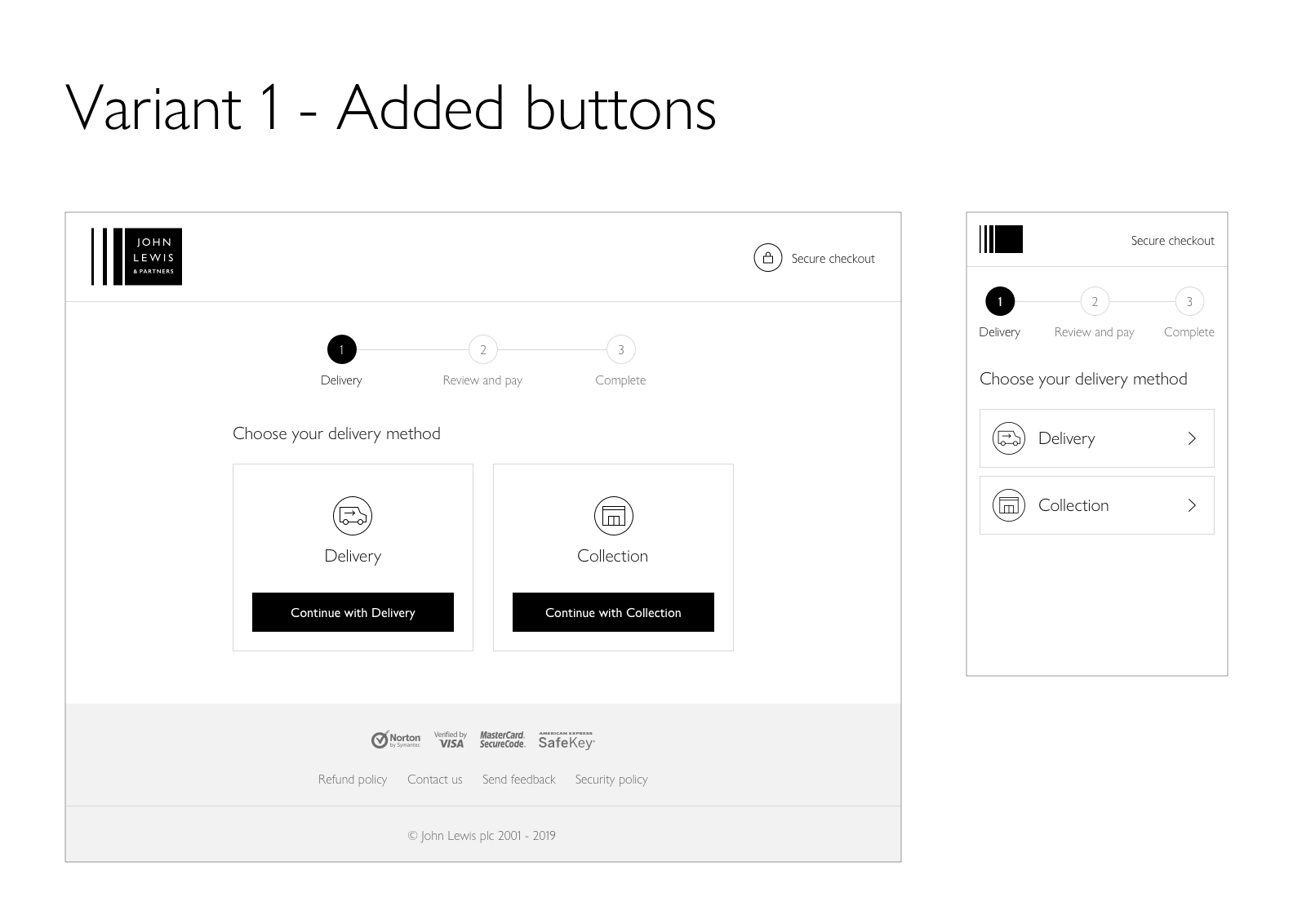
Exploring a future one-page checkout concept through low-fidelity wireframes before visual design.
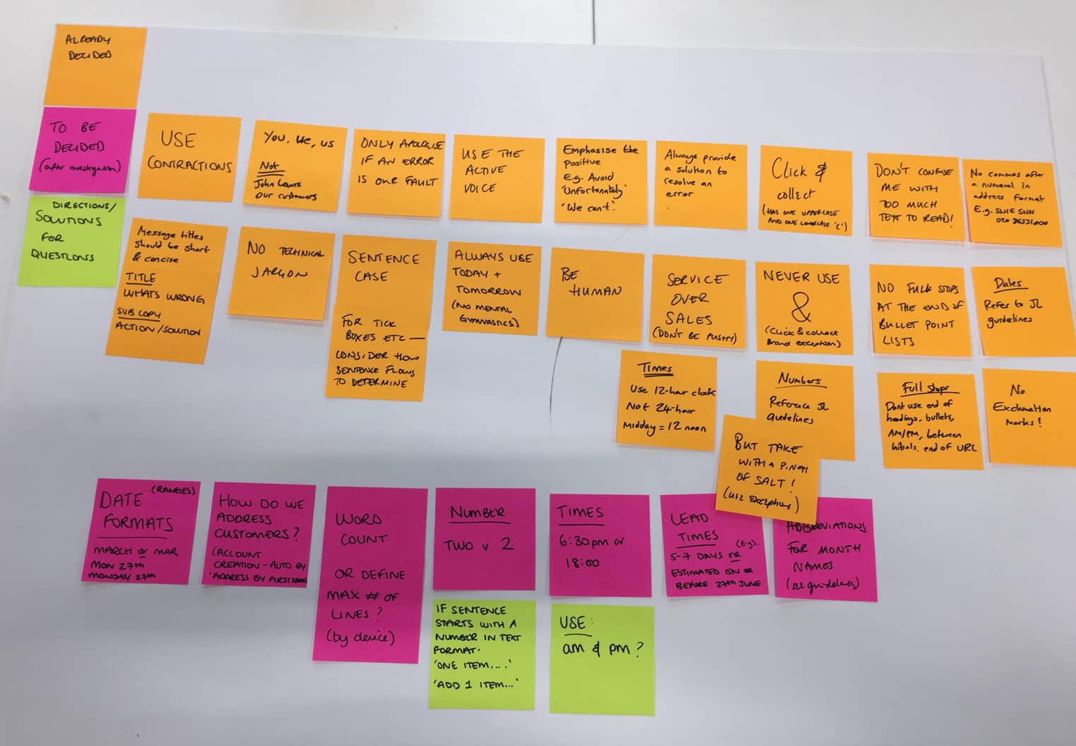
Collaborative copywriting workshop to align tone of voice and messaging across the checkout experience.
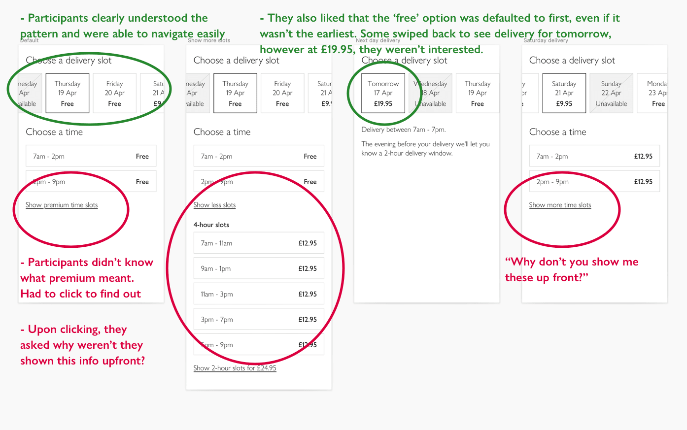
Moderated user testing session evaluating delivery options and identifying usability issues prior to development.


A multivariate test comparing the control design against three alternatives to identify the highest-converting solution.
Alongside user insight, commercial KPIs such as conversion, drop-off, and error rates shaped prioritisation. My role was to translate this into clear design solutions that balanced customer experience with technical and business constraints.
The checkout supported a wide range of overlapping journeys, each with its own edge cases and constraints:
My responsibility was to ensure these journeys felt coherent and predictable, even as users moved between flows. Consistency was critical to maintaining confidence through to payment.
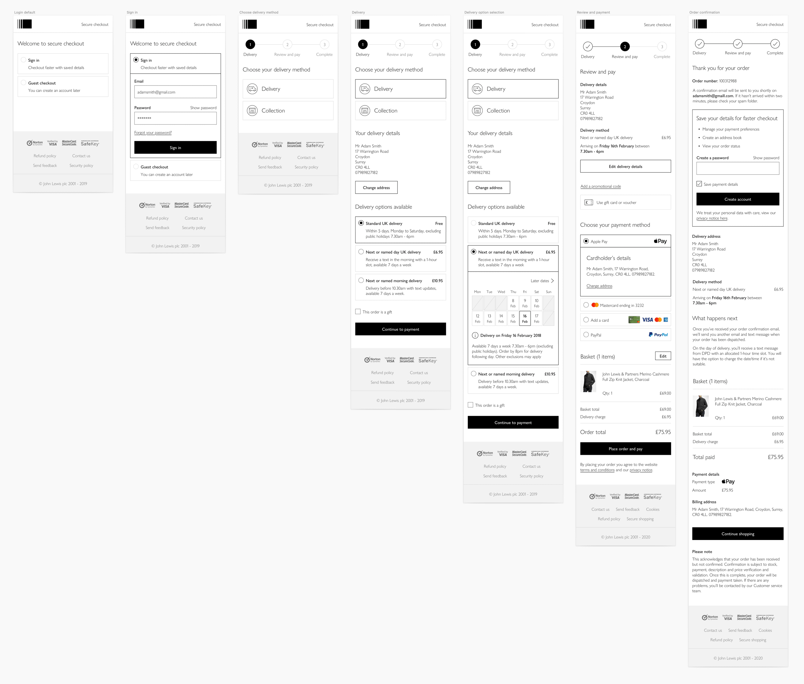
One of many user journeys — a customer with an account getting their order delivered via named day delivery.
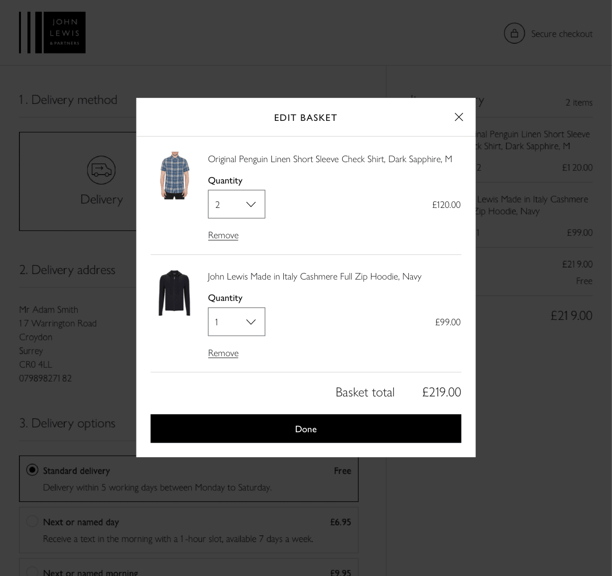
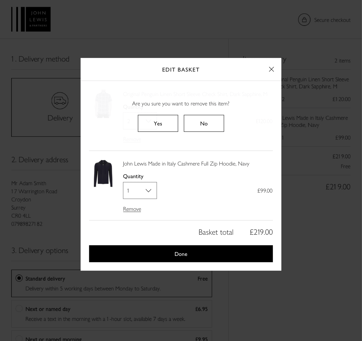

Improving the item-removal experience during checkout to prevent accidental basket abandonment.
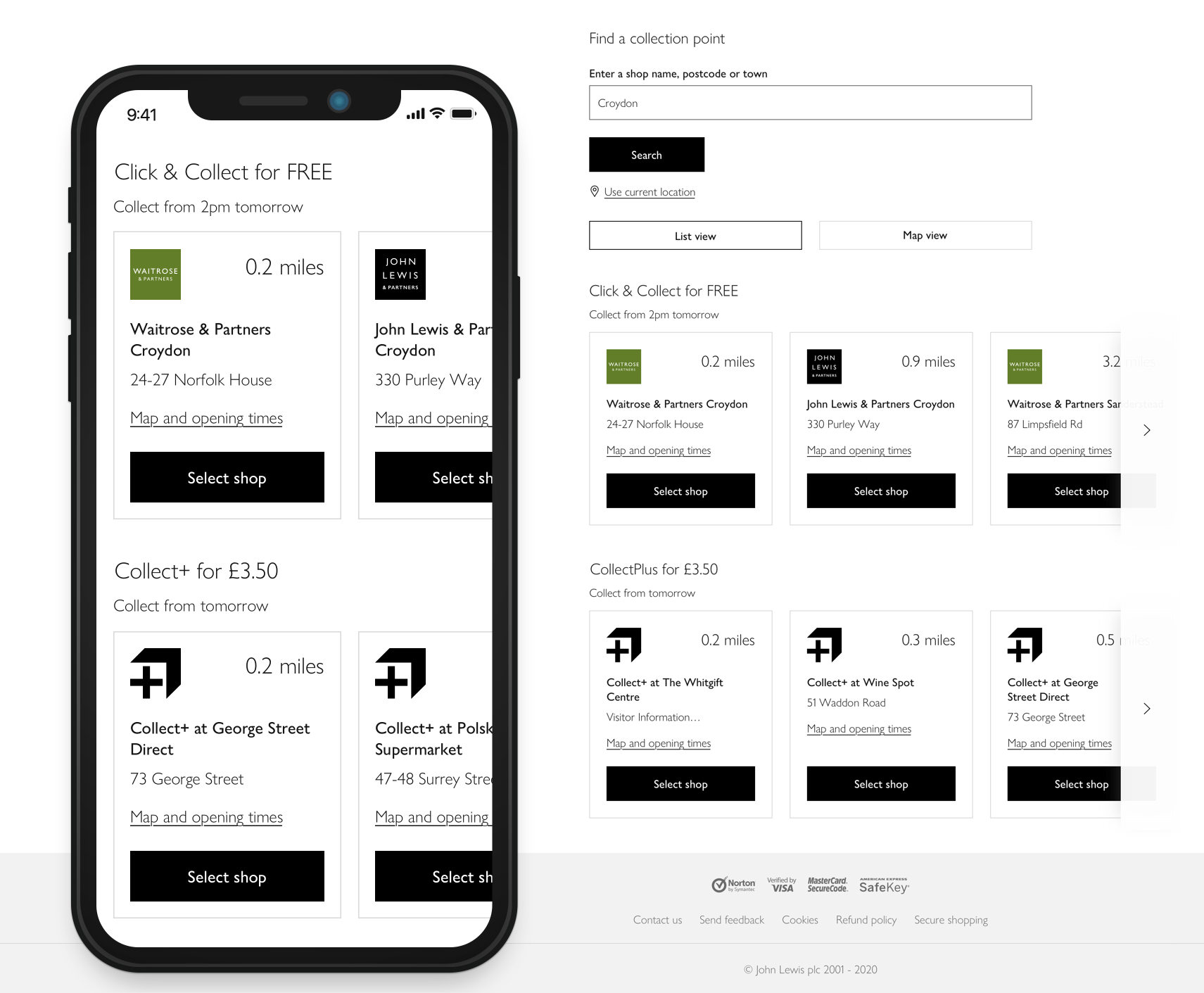
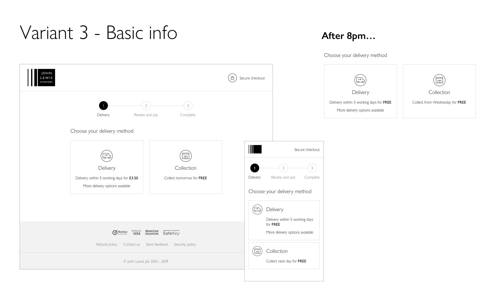
Reimagining the collection proposition to create a smoother user experience that also meets business objectives.
During my time at John Lewis, the organisation underwent a major rebrand. As a lead designer, I co-created and helped maintain a new design system used by teams across the business.
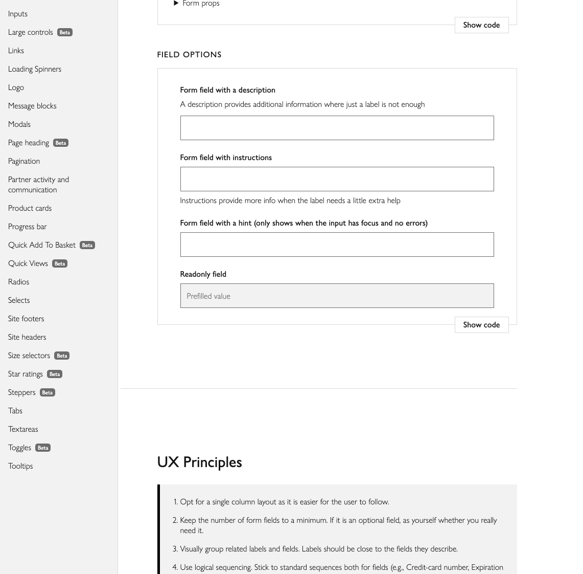
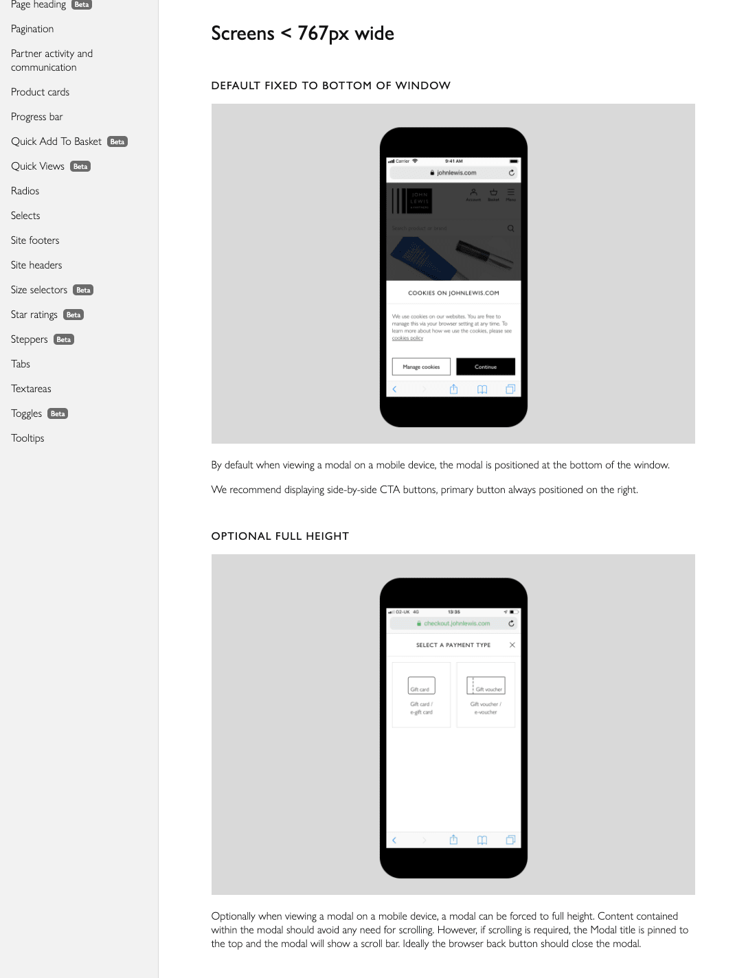
My primary focus included forms, modals, messaging — critical components within checkout and other high-risk journeys. This included defining patterns for inputs, validation, error handling, instructional copy, and responsive behaviours across desktop and mobile.

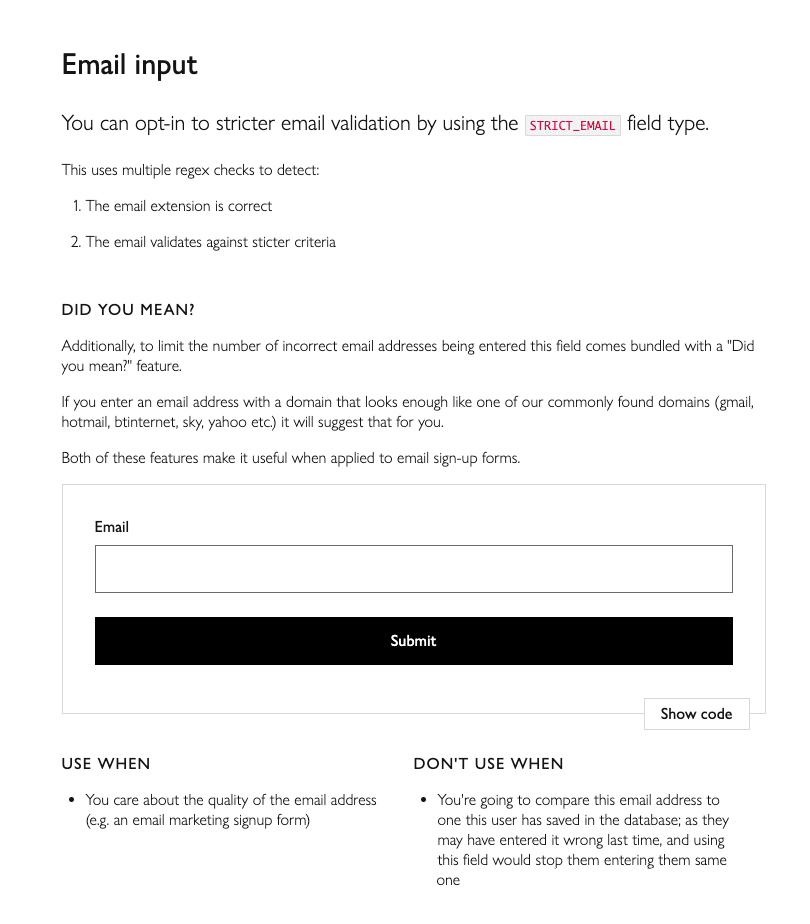


Accessible error messaging designed to support keyboard, mouse, and screen reader users.
In 2019, the checkout was independently audited by the Baymard Institute, providing an external benchmark against leading global e-commerce experiences.

Summary of John Lewis' overall performance on the left, and a breakdown of the mobile experience on the right. Checkout and form usability being amongst the best performing areas.
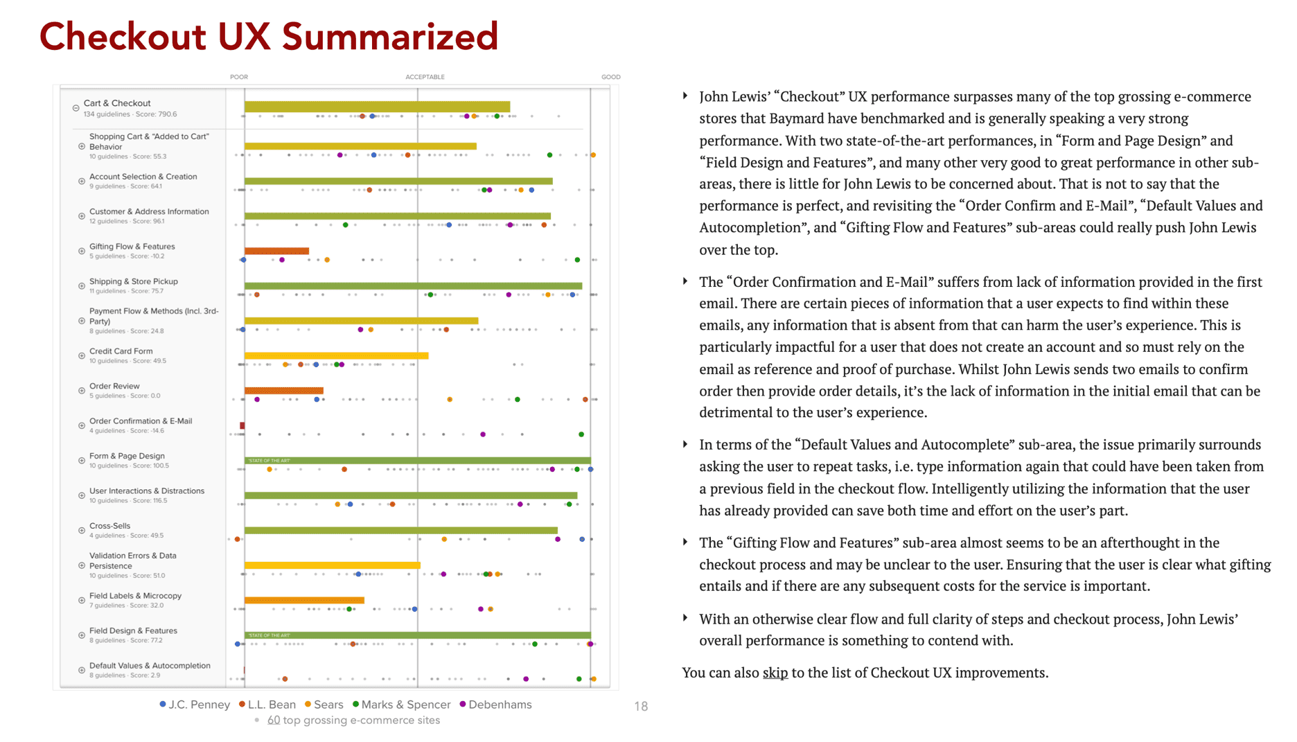
A breakdown of the checkout areas including some that were 'state of the art'.
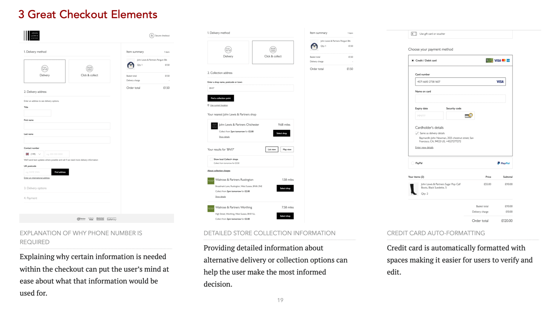
A few elements Baymard have picked out as an example of what a good checkout must have.
This case study represents an overview of my work on the John Lewis checkout. Across multiple years, features, and iterations, the focus remained the same: reduce friction, increase confidence, and deliver a checkout experience that performs at scale.